
It’s the small interactions that really make a website feel professional. Subtle CSS hover effects are a great example. These lightweight micro interactions improve usability, highlight clickable elements, and add a touch of modern design without slowing your site down.
If you’re building sites with Beaver Builder, you can easily apply CSS hover effects to buttons, links, and images. Below you’ll find 8 simple hover effects with step-by-step instructions and ready-to-use CSS snippets.
How to Add Custom CSS in Beaver Builder
Before diving into the examples, let’s quickly cover how to apply custom CSS in Beaver Builder:
Global CSS:
- In WordPress, go to Appearance → Customize → Additional CSS.
- Paste your CSS here to apply across the whole site.
Per Module CSS:
- Open a module, row, or column in Beaver Builder.
- Go to Advanced → HTML Element → Class.
- Add a class name (e.g., hover-underline).
- Reference that class in your CSS.
Pro Tip: Keep a master stylesheet of reusable effects. It’ll save you hours across multiple projects.
1. CSS Hover Underline Animation for Heading Text
See the Pen Text Underline Hover Effect by Some Web Studio (@somewebstudio) on CodePen.
Option 1 – Left to Right
A sleek replacement for the default underline. Instead of instantly appearing, the line animates from left to right.
Step-by-Step:
1. Add a Heading module.
2. Wrap your link with a class. Paste this HTML into the Heading field (replace “Your Text Here” with your desired text):
<a href="#" class="hover-underline-left">Your Text Here</a>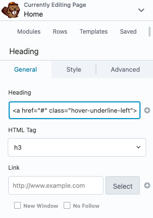
3. Paste this into your global CSS (update the background element with your desired underline color):
.fl-module-heading .fl-heading-text a.hover-underline-left {
	position: relative;
	display: inline-block;
	text-decoration: none;
	color: inherit;
}

.fl-module-heading .fl-heading-text a.hover-underline-left::after {
	content:"";
	position:absolute;
	left:0;
	bottom:-3px;
	height:2px;
	width:0;
	background:#f28c7c; /* underline color */
	transition:width .3s ease;
}

.fl-module-heading .fl-heading-text a.hover-underline-left:hover::after {
	width:100%;
}
Option 2 – Center Start
Here’s another option where the underline starts in the center and animates outward.
Step-by-Step:
1. Add a Heading module.
2. Wrap your link with a class. Paste this HTML into the Heading field (replace “Your Text Here” with your desired text):
<a href="#" class="hover-underline-center">Your Text Here</a>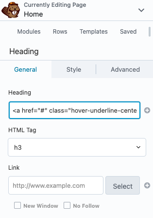
3. Paste this into your global CSS (update the background element with your desired underline color):
.fl-module-heading .fl-heading-text a.hover-underline-center {
	position: relative;
	text-decoration: none;
	color: inherit;
}

.fl-module-heading .fl-heading-text a.hover-underline-center::after {
	content: "";
	position: absolute;
	left: 0;
	bottom: -3px;
	width: 100%;
	height: 2px;
	background: #f28c7c; /* underline color */
	transform: scaleX(0);
	transform-origin: center;
	transition: transform 0.3s ease;
}

.fl-module-heading .fl-heading-text a.hover-underline-center:hover::after {
	transform: scaleX(1);
}
Option 3 – Right to Left
With this option the line animates from right to left.
Step-by-Step:
1. Add a Heading module.
2. Wrap your link with a class. Paste this HTML into the Heading field (replace “Your Text Here” with your desired text):
<a href="#" class="hover-underline-right">Your Text Here</a>
3. Paste this into your global CSS (update the background element with your desired underline color):
.fl-module-heading .fl-heading-text a.hover-underline-right {
	position: relative;
	text-decoration: none;
	color: inherit;
}

.fl-module-heading .fl-heading-text a.hover-underline-right::after {
	content: "";
	position: absolute;
	left: 0;
	bottom: -3px;
	width: 100%;
	height: 2px;
	background: #f28c7c; /* underline color */
	transform: scaleX(0);
	transform-origin: right;
	transition: transform 0.3s ease;
}

.fl-module-heading .fl-heading-text a.hover-underline-right:hover::after {
	transform: scaleX(1);
}
2. CSS Hover Underline Animation for Button Text
See the Pen Untitled by Some Web Studio (@somewebstudio) on CodePen.
Option 1 – Left to Right
Here’s how to use the animated underline on button text, with the line animating from left to right.
Step-by-Step:
1. Add a Button module.
2. Wrap your link with a class. Paste this HTML into the Text field (replace “Your Text Here” with your desired text):
<span class="btn-text-underline-left">Your Text Here</span>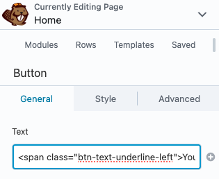
3. Paste this into your global CSS (update the background element with your desired underline color):
.fl-module-button .fl-button .btn-text-underline-left {
	position: relative;
	display: inline-block;
	text-decoration: none;
	color: inherit;
}

.fl-module-button .fl-button .btn-text-underline-left::after {
	content: "";
	position: absolute;
	left: 0;
	bottom: -3px;
	width: 0;
	height: 2px;
	background: #f28c7c; /* underline color */
	transition: width 0.3s ease;
}

.fl-module-button .fl-button:hover .btn-text-underline-left::after {
	width: 100%;
}
Option 2 – Center Start
Here’s the code for an underline that starts in the center and grows outward, updated for button text.
Step-by-Step:
1. Add a Button module.
2. Wrap your link with a class. Paste this HTML into the Text field (replace “Your Text Here” with your desired text):
<span class="btn-text-underline-center">Your Text Here</span>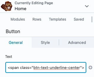
3. Paste this into your global CSS (update the background element with your desired underline color):
.fl-module-button .fl-button .btn-text-underline-center {
	position: relative;
	display: inline-block;
}

.fl-module-button .fl-button .btn-text-underline-center::after {
	content: "";
	position: absolute;
	left: 0;
	bottom: -3px;
	width: 100%;
	height: 2px;
	background: #f28c7c; /* underline color */
	transform: scaleX(0);
	transform-origin: center;
	transition: transform 0.3s ease;
}

.fl-module-button .fl-button:hover .btn-text-underline-center::after {
	transform: scaleX(1);
}
Option 3 – Right to Left
Finally, here’s the code to animate the underline from right to left, updated for button text.
Step-by-Step:
1. Add a Button module.
2. Wrap your link with a class. Paste this HTML into the Text field (replace “Your Text Here” with your desired text):
<span class="btn-text-underline-right">Your Text Here</span>3. Paste this into your global CSS (update the background element with your desired underline color):
.fl-module-button .fl-button .btn-text-underline-right {
	position: relative;
	display: inline-block;
}

.fl-module-button .fl-button .btn-text-underline-right::after {
	content: "";
	position: absolute;
	left: 0;
	bottom: -3px;
	width: 100%;
	height: 2px;
	background: #f28c7c; /* underline color */
	transform: scaleX(0);
	transform-origin: right;
	transition: transform 0.3s ease;
}

.fl-module-button .fl-button:hover .btn-text-underline-right::after {
	transform: scaleX(1);
}
3. Gradient Shift on Text
Turn plain text into animated gradient text when hovered.
See the Pen Text Gradient Shift by Some Web Studio (@somewebstudio) on CodePen.
Step-by-Step:
1. Add a Text Editor or Heading module.
2. Wrap the text in a span with a class (replace “Your Text Here” with your desired text):
<span class="gradient-text-hover">Your Text Here</span>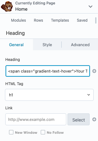
3. Paste this into your global CSS (update the background element with your desired gradient colors):
.gradient-text-hover {
	text-decoration: none;
	transition: color 0.4s ease,
	background-position 0.6s ease;
	background: linear-gradient(45deg, #E262AB, #6F9EF4, #4CE3D9); /* gradient colors */
	background-size: 200%;
	background-position: left;
	-webkit-background-clip: text;
	-webkit-text-fill-color: transparent;
}

.gradient-text-hover:hover {
	background-position: right;
	color: transparent;
}
4. Gradient Shift on Buttons
Highlight CTAs with a moving gradient background.
See the Pen Button Gradient Shift by Some Web Studio (@somewebstudio) on CodePen.
Step-by-Step:
1. Add a Button module.
2. Under Advanced → HTML Element → Class, add gradient-btn.
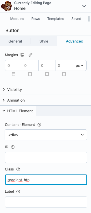
3. Remove any background color set inside the module.
4. Paste this into your global CSS (replace the colors inside the background-image element with your desired gradient colors):
.fl-module-button.gradient-btn .fl-button {
background-image: linear-gradient(45deg, #E262AB, #6F9EF4, #4CE3D9) !important; /* gradient colors */
background-size: 200% 100% !important;
background-position: left center !important;
background-color: transparent !important;
transition: background-position 0.5s ease,
color 0.5s ease;
}
.fl-module-button.gradient-btn .fl-button:hover,
.fl-module-button.gradient-btn .fl-button:focus {
background-position: right center !important;
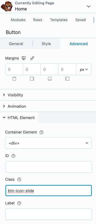
}5. Button Icon Slide
Adds an animation for a button icon that slides to the right when hovered.
See the Pen Button Icon Slide by Some Web Studio (@somewebstudio) on CodePen.
Step-by-Step:
1. Add a Button module with an icon.
2. Under Advanced → HTML Element → Class, add btn-icon-slide.
3. Paste this into your global CSS:
.fl-module-button.btn-icon-slide .fl-button {
color: inherit;
border: none;
display: inline-flex;
align-items: center;
}
.fl-module-button.btn-icon-slide .fl-button i,
.fl-module-button.btn-icon-slide .fl-button svg {
transition: transform 0.3s ease;
}
.fl-module-button.btn-icon-slide .fl-button:hover i,
.fl-module-button.btn-icon-slide .fl-button:hover svg {
transform: translateX(5px);
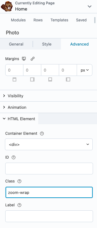
}6. CSS Image Zoom on Hover
Apply a subtle zoom-in effect to images when hovered. Perfect for portfolios or blog thumbnails.
See the Pen Image Zoom Hover Effect by Some Web Studio (@somewebstudio) on CodePen.
Step-by-Step:
1. Add a Photo module.
2. Under Advanced → HTML Element → Class, add zoom-wrap.
3. Paste this into your global CSS:
.zoom-wrap {
	overflow: hidden;
	display: inline-block;
}

.zoom-wrap img {
	transition: transform 0.4s ease;
	display: block;
}

.zoom-wrap:hover img {
	transform: scale(1.1);
}
7. Image Caption Overlay Reveal
Replaces the default caption hover with a smooth sliding animation.
See the Pen Image Caption Reveal by Some Web Studio (@somewebstudio) on CodePen.
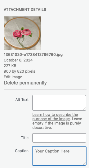
Step-by-Step:
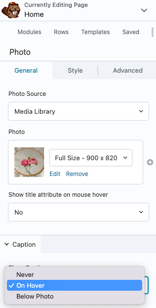
1. Add a Photo module.
2. Find your image in the Media Library and add your desired text to the Caption field.
3. In General → Caption, select the “On Hover” option.
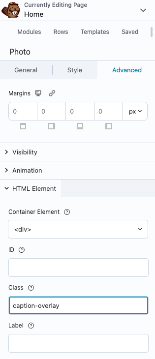
4. In Advanced → HTML Element → Class, add: caption-overlay
5. Paste this into your global CSS (there are several settings you can tweak based on your preferences: background, color, font-family, font-size, and font-weight):
.fl-module-photo.caption-overlay .fl-photo-content {
	position: relative;
	overflow: hidden;
}

.fl-module-photo.caption-overlay .fl-photo-img {
	display: block;
	width: 100%;
	height: auto;
}

.fl-module-photo.caption-overlay .fl-photo-caption {
	position: absolute;
	left: 0;
	right: 0;
	bottom: 0;
	margin: 0;
	padding: 1rem;
	background: rgba(0,0,0,0.6); /* caption background color */
	color: #fff; /* caption text color */
	font-family: Arial, sans-serif; /* update to desired font family */
	font-size: 1.5rem; /* update to desired font size */
	font-weight: 500; /* update to desired font weight */
	transform: translateY(100%);
	opacity: 0;
	transition: transform .3s ease,
	opacity .3s ease;
}

.fl-module-photo.caption-overlay .fl-photo-content:hover .fl-photo-caption {
	transform: translateY(0);
	opacity: 1;
}
8. Image Blur with Text Reveal
On hover, the image blurs and overlay text fades in.
See the Pen Image Blur + Text Reveal by Some Web Studio (@somewebstudio) on CodePen.
Step-by-Step:
1. Add a Photo module.
2. Find your image in the Media Library and add your desired text to the Caption field.
3. In General → Caption, select the “On Hover” option.
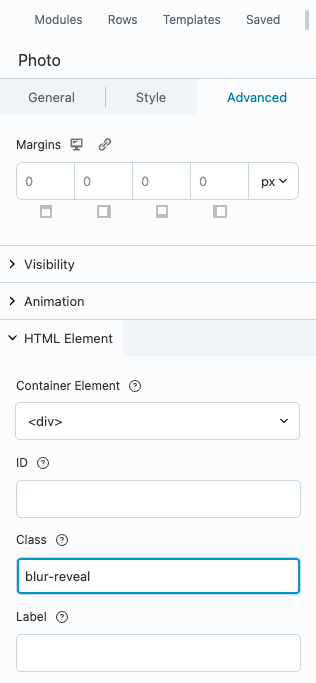
4. In Advanced → HTML Element → Class, add: blur-reveal
5. Paste this into your global CSS (there are several settings you can tweak based on your preferences: background, color, font-family, font-size, and font-weight):
.fl-module-photo.blur-reveal .fl-photo-content {
	position: relative;
	overflow: hidden;
}

.fl-module-photo.blur-reveal .fl-photo-img {
	display: block;
	width: 100%;
	height: auto;
	transition: filter .3s ease;
}

.fl-module-photo.blur-reveal .fl-photo-content:hover .fl-photo-img {
	filter: blur(4px);
}

.fl-module-photo.blur-reveal .fl-photo-caption {
	position: absolute;
	inset: 0;
	margin: 0;
	padding: 1rem;
	display: flex;
	align-items: center;
	justify-content: center;
	background: rgba(0,0,0,0.35); /* caption background color */
	color: #fff; /* caption text color */
	font-family: Arial, sans-serif; /* update to desired font family */
	font-size: 1.5rem; /* update to desired font size */
	font-weight: 500; /* update to desired font weight */
	opacity: 0;
	transition: opacity .3s ease;
}

.fl-module-photo.blur-reveal .fl-photo-content:hover .fl-photo-caption {
	opacity: 1;
}
Best Practices for Hover Effects
- Don’t overdo it: Pick 2–3 effects for key CTAs or visuals.
- Be consistent: Use the same style across similar elements.
- Check accessibility: Ensure text remains readable with overlays or gradients.
- Test on mobile: Hover doesn’t exist on touch screens, so hover effects shouldn’t be the only indicator of interaction.
Check Out Our Premium Beaver Builder Templates
Adding CSS hover effects is one of the easiest ways to upgrade your Beaver Builder sites. Whether you want a css hover underline for links, a css image zoom for portfolios, or interactive css button animations for CTAs, these micro interactions will make your designs feel modern and professional.
If you want to save even more time, explore Beaver Templates’ collection of professionally designed Beaver Builder website templates. They’re optimized for speed, SEO, and customization, and with effects like these, you’ll have client sites that look amazing and convert better.
For more css animation examples and inspiration, check out these links:
